Clip Clop the Wonder Horse is done!

Well, almost done.  I’d like to clear coat it after it dries and cures for a while.  Mode Podge seems like an excellent thing for the job, but I only have matte and semi-matte but figure this horse should stay shiny?

Today I wanted to work on it, but I still hadn’t settled on a plan.  I thought I’d start by using the paints that I have on hand and see how things went.  Obviously I made a decision or two, and it is done.  Gold isn’t really a tone I’m fond of, but my husband is even less keen on it.  It is classic though, and suddenly Clip Clop has been gilded!

IMG_1193

IMG_2148

The handles needed a coat or two of something dark, and the eyes needed some life.  The other aim today was to add depth to the tail and mane.  By now I thought that the horse already looked splendid and wasn’t entirely sold on messing with it, but wouldn’t the hair look more alive with some shadows defining the moulded strands?  I had to just add a little of the dark iron paint in there…


Then I toyed with the dark and light silver metallics on the the saddle.  Impulsively squeezed out a bit of bright golden paint, dipped a brush into it, and painted the blanket stars.  Well, didn’t it need a bit more gold then?  I hesitated and pondered for a while not wanting to ruin what I liked.  Finally I went ahead and committed to a gilded saddle and bridle.  I didn’t start it timidly with a dull polish or anything.  No, it was to be a fully golden saddle for my little girl!

IMG_1203

It is actually a very true and less dull gold in real life.  I guess I need to change some settings on my camera to capture it, and my phone had trouble with the shine which led me to use the camera.  It seems I missed photographing the golden horseshoes, but Clip Clop has those now too!

I can tell you that she loves it.  Already she seems to know that this is her horsey and where to find it.  Although I’ve moved it a few times to different rooms for various reasons she has set off each morning on a rapid crawl directly to her horse.  Then she uses it to stand, slaps and bounces a bit, and smiles back at me.  I’ve lifted her into the saddle, and she surprised me by balancing without trouble and makes it bounce by whipping her torso ahead.  Obviously I’m there with hands waiting to catch her, and I don’t(didn’t) plan for this toy to be used for a while.  Anyway, I suspect she likes shiny things?  And Springs!

I can’t believe the difference Before and after:

During (and really good enough looking) vs done:

Details:

IMG_1202


IMG_1190


In progress: painting a vintage Wonder Horse (Bouncing rocking horse)

Well, that was fast.

After posting this morning I managed to do some chores and spend time spraying the horse.  I started with medium grey (metallic) over the primer covering everything as a base.  Then I used the darkest grey (metallic) focussing on the muzzle, underbelly,  hind quarters and lower legs.  Finally I sprayed pearly white using cardboard scraps to mask the areas I wanted left dark.  Holes were cut to stay the dapples.

The dark layer went well and so did the white initially.  I was really happy with the dapples and look.  Then I thought “I’ll just add a little more…”

Shoot.  I did not take photos at the point, but just as well probably since it would only remind me.  I wasn’t pleased by the time I sprayed a little more.  Meanwhile my little one was getting sick of her play-pen inside, so I rushed on, took breaks, and rushed through.  I believe I’d have had different outcome if able to focus the way that I used to.  😉  Anyway, I left it to dry all afternoon and was somewhat more pleased when I saw it again.  Yes, the dapples were all but lost, but it still looks good if you didn’t know my original vision for it.  The white paint has turned into a very silver metallic that blends too much with the other two shades, and that is part of the dapple problem.  Again, it is pretty enough if you don’t know the intended look.  It seems that a rather aged and then polished iron kind of  style won out despite my plans!

During the afternoon I dug around the mess of our attic (my fault!) to find the little bottles of paint from the Borg Queen costume after not finding them in the basement paint storage area or in the sewing room.  They were in the attic, and I did find them eventually, and that is a win given a poor streak of luck I had the past few days.  (I wouldn’t have purchased more, because I already did that for the last Borg Queen when I couldn’t find the original paints!)  So next I’ll either enhance the details on the mane, tail, and tack with these paints and tiny brushes or I’ll detach the stand and spray that.  Tomorrow we’ll have some rain before clear weather again, so that and life may delay this.

Ideally I’d maybe like some blues or other colours in the saddle, but I have only copper, silver, black (spray,) and gold to work with.  Unless the project is delayed and I suddenly go shopping then those are all I’ll be using.  It already looks pretty nice as is and could certainly stay without any additional work.  Perhaps, but I don’t think I can leave well enough alone.  That would be too easy!  I still might mask off the horse fur area after today’s paint is cured and spray the saddle a flat black first?  I don’t know.

Here it is with the dark layer:

IMG_1428

and white:

IMG_1434

Dried later on and in different lighting:

IMG_1444.jpg

Closer:

IMG_1448.jpg

IMG_1447.jpg

IMG_1454.jpg

See how metallic silver it appears rather than pearlescent grey and white?  Notice that the neck area no longer shows the dappled paint I’d done?  Oh well, I suppose…

Let’s not forget before:

IMG_1152


In Progress: Reviving an ugly old “Wonder Horse” bouncing rocking horse

I’ve been working on many projects at once lately, and always the choice is between writing or making some progress (that and the treadmill of my normal chores.)  Tonight I could write about a few different things, but I’d like to take a break from sewing and feel inspired by a painting project that is only in the beginning stages.

When I was a child there was a toy that brought me hours of screeching glee.  Memories of playing with it stick out through the vague mists of about 30 years, and I decided months ago that my daughter simply had to have a springy-bouncy-horse like mine.  Marketed as “Clip Clop the Wonder Horse” in the mid ’80s I was a lucky kid to own this newest version of plastic horse (now with sound effects!) suspended by springs from a metal frame to bounce on merrily like other fortunate children since mid-century.  Mine was named Clippity Clop, and I loved him.

It seems Radioflyer still makes a similar Wonder Horse, but I wanted a fixer upper.  (Shocking, I know!)  After all, the ’80s or ’70s orange and browns of these horses is just not appealing to my design sense, and the new ones look about the same.  For a while I’d check out Craigslist whenever I remembered to but none of the listings grabbed me until a few weeks ago when there was a Wonder Horse from the ’70s offered at the lowest price I’d ever seen and decently nearby.  (When we moved here it was farther away from all the wonderful listings to be found on Long Island to a less popular and overpriced CL region.  sigh.)

IMG_1152.jpg

The model isn’t the same obviously, but sound certainly isn’t required.  I thought surely Clip Clop was bigger, because I was surprised at how small this horse was when I picked it up, but as a little kid everything seems bigger.  Googling shows that they measure the same.  The downside of the horse I’ve picked up is that it doesn’t have the stepping rail to get and off that mine had.  Perhaps I can add something for that?

I did some reading on painting plastic but ended up grabbing all-purpose spray paint from Home Depot instead of hunting down Krylon.  In the store I was undecided and selected a variety of paints to play with or return once I figured out what colours and effects to use.  Some ideas ran through my head.  First being to use chalk paint or a super matte in greys and whites (typical, I know.) My next thought while looking at a wall of spray paint options was to maybe dive into colour with a little soft sea foam or purple or something (woah!) accenting a pearly white horse.  There was a great selection of metallics, and I always have found hammered finish very forgiving so that was another direction…  Either hammered or a smooth aged iron kind of look blackened in the crevasses.  I still like that idea a lot.  A can of silver glitter paint made me consider that my little girl may think a glittery horse is fantastic, but I couldn’t make the leap.  Lastly is a dappled grey and white horse reserving the metallic for tack.  This is the plan right now; dapple grey and white with darker legs etc and salt and pepper tail/mane.  Honestly I’m a little tempted to do glitter after all, but I don’t have that paint now.  😀  Let’s see how things go when I get spraying…

IMG_1154.jpg

Screen Shot 2018-06-12 at 07.17.58.png

First I had to clean the horse, then sand, and prime everything.  Last week I did this.  I scoured the stand too and probably will try some paint on that also but done thinly and using dark metallic just to freshen it up.  The springs polished up nicely to look brushed and silvery.  The horse itself is full of imperfections in the casting.  I cut off some of the worst seams, but I’m not about to fill all the voids and air bubbles so had to quit worrying about it.  The original paint was peeling a bit, besides being a hideous colour choice, and it was very sloppily done.  I’ll have to try to emulate that vagueness to a degree since the detail of the plastic is so rough.  Anyway, I sanded it well and washed it all down before masking the frame and carefully priming on a warm and dry day.  The primer instructs to wait 5-7 days before painting if the object is plastic, so I have been patient.  She isn’t going to use this thing anytime soon anyway, and so I’ll be going slowly and letting layers cure well between work although I’d like to just have it out of the way soon.

IMG_1146.jpg

IMG_1157.jpg

IMG_1162.jpg

With the primer it already looks pretty good!  Almost good enough to be done, heh.

Today I’ll test out the first base layer in either pearly white or shimmering grey.  If it enhances every flaw and looks horrendous then I’ll reconsider glitter or something else.


Painting, Painting…

I expected that my next post would be about the tiling projects from December/January, but that can wait.  Yesterday I painted the nursery and just about completed it (aside from another coat of trim paint on part of the panelling and work on the windows.)  This room has been the most ridiculously involved painting project I can remember doing.  It seems like I’ve been patching, caulking, caulking, caulking, brushing, and more for ages.  Judging by the timeline in photos, I have been!

IMG_0046

Before:

guest room blue

At first I’d planned to paint this room with a colour matched gallon of deep blue that I purchased in the fall.  It was dark, and I doubt I’d have picked it on my own, but L loves dark blue, people have remarked since we bought the place that it was particularly lovely, and it happened to go very well with some linen curtains I’d scored at a thrift store some years ago and finally had a chance to use.  However, it is a very dark shade which sucks away the light.  Most of the main floor of the house is done with dark paint, and I’m sometimes regretting that fact.  Then it became clear that instead of being a guest suite we’d be turning it into a nursery for MiniMonkey.

I still thought I’d just use the blue paint, and it didn’t bother me whether girl or boy.  I just hoped the kid would like dark blue!   But… soon I was thinking how nice it would be to plan something from scratch: something lighter and brighter.  When I asked L about it (expecting he’d prefer to stick with what we had due to preference for the colour and to avoid buying more paint) he said it was a good idea.  Still, I didn’t jump on it.  The ceiling paint was in poor condition, and I knew I’d have to begin there.  I despise painting ceilings, I really do, but there wasn’t any avoiding it.

There was so much prep-work to tackle first.  The crown moulding had gaps all around and needed caulking.  It was the same with the trim of the panelling too, and it really took forever to get to the point of painting, because I dutifully primed it all too.  It wasn’t only the panelling to prime and coat a few times with ‘coconut ice.’  Only the entry door had been (mostly) painted after moving in, and I had to do the bathroom and closet doors.   Actually, the windows have yet to be primed and painted except the parts along the drywall.  Once spring finally arrives I must remove all the ugly motion sensors, fill the holes, and paint when they can be opened.

A few weeks ago I grabbed some purplish paint chips while at the store.  I’d been feeling fond of purples and aquas for a while, but aqua seems tough to get right (besides, L doesn’t like green and considers many aquas too green) and would be more difficult to coordinate well with the ’60s blue tiles in the bathroom.  Only one chip looked decent at all.  Another could have been nice elsewhere but read a bit too tan in this lighting.  I left it up for a while, and L immediately agreed to it when I showed it to him.  He answered so fast I’m still skeptical that he could have even seen it, but he always has been extremely quick to judge that he likes something.  😀

We had just found out Mini is a girl when I showed him the colour.   (Uh, hopefully the accuracy of that determination isn’t called into question later, because I’m very set on her name!)  Again, we were fine with a light purplish shade for either, but it does push the envelope a bit now that I’ve seen the entire room in it.  It’s so very… PASTEL and infantile, but then again it is a nursery, heh.  In a few years I can slap on the blue again or something else.  I do like it, but it is quite a change!


Now I’m just waiting to furnish and set up the room, but I do feel I ought to wait.  As much as it would be nice to start setting up the crib I might as well let more time pass.  So far I’ve removed the antique dresser and am hoping to refinish one stored at my dad’s, and I bought a laundry hamper.  That’s it.  I may or may not try out the new positioning of the bed shortly, since it must be moved for painting.  I haven’t any ideas for decoration, but I removed the curtain rods at the last minute and will likely do shades instead.  It’s very much a work in progress…

The only thing that caught my eye for decor was that I remembered seeing mounted butterflies on eBay years ago that were very pretty.  Then I was at Home Goods and happened to see a beautiful shadowbox arrangement thing made of them and beetles.  I was stunned when I saw it and gleefully eyed the red sticker indicating that it was on clearance, but then I saw the actual price and sighed.  $250 was not happening.  So sad.  I took photos instead.  I also saw a pretty carpet.  There aren’t really any plans to get a carpet, and I have no idea if I’d want one that looks like this, but I liked it enough to take a photo.  (It is too feminine, I think, unless I’d used pale grey as the wall colour.)   Those butterflies though!  Sigh

IMG_9737


Stencilling a Subfloor: a budget friendly makeover

Ah, this was a project I planned to tackle before we even moved into our house just over two years ago.  How time flies!

img_9598

Perhaps you’ve already read about my first stencilling project?  Well, I knew that the solution to the stained (and in my opinion very unappealing) master suite carpeting was to rip it out and stencil just like I’d done to the apartment kitchen.  I even decided to stick with the same colours  and pattern!  According to the mix information I purchased the paint for this before we even moved… and here I am finally done with it.

I began tearing up the carpet on Monday the 13th thinking that with luck I could be done for the weekend.  Ha!  I just completed it on Thursday and only did so by opting not to clear coat.  (I’d wanted to do everything properly and thus apply several coats and let it dry for days as directed, but that meant not stepping into the room until next week, doing things in stages thanks to furniture issues, plus a lot of work… nah.  It’s good.)

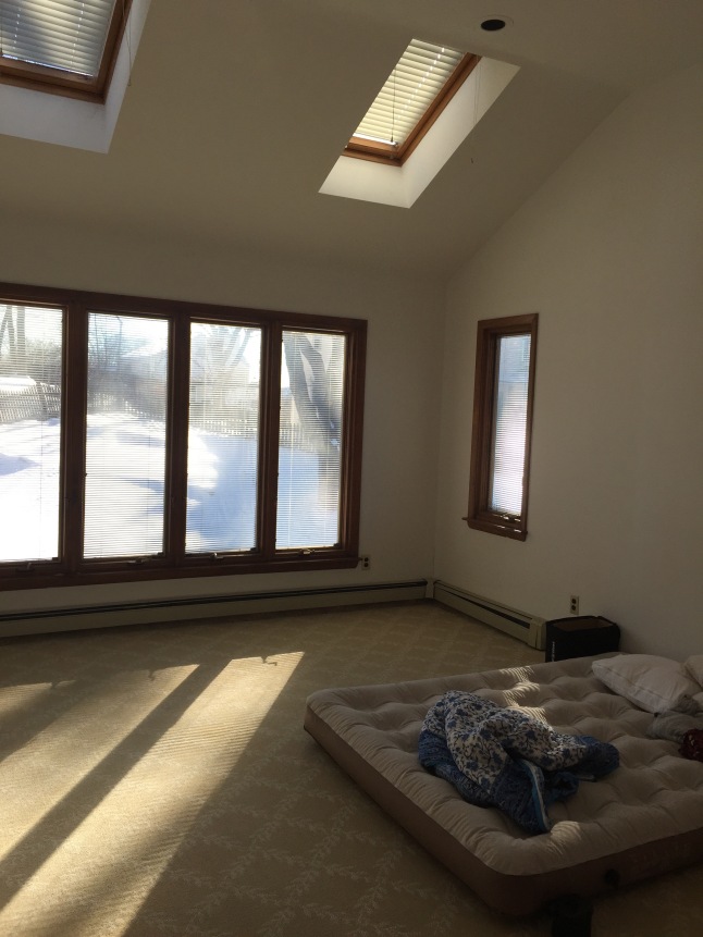
Here is a before picture showing the carpeting.  It seems I did not take many photos of the room before we moved in, and you do not see the brown mystery stains here.  Any shades of tan, beige, and brown have never been my thing, and by the time I finally began tearing it out the carpet had additional pulls and damage.  It was beyond time to go.

img_5290

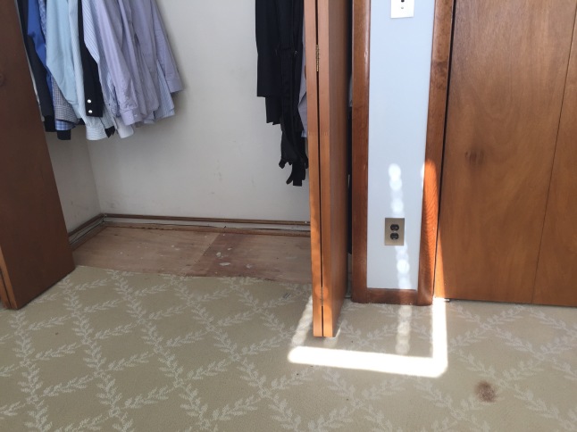
It was easiest to start inside the closets, and oh look!  A mystery stain!

img_9323

The padding underneath was actually really nice, but it had to go since I wasn’t about to put in another dust collecting carpet.  Annoyingly, previous workers had been rather careless with spackle and paint which left the floor a bit lumpy.  I didn’t want to try sanding anything though, because with the plywood it seemed weird to.

This was a lot of work, and I didn’t quite finish removing the carpet on day one.  I’d begun thinking it was perfect timing to bring the trash out for collection the next morning, and it ended up being 12 contractor bags full at the kerb not counting what was still on the floor when I quit for the evening.  At this point I may have been having a second thought or two.  The were about two million staples to find and pull up!

Last time when I stencilled the apartment kitchen floor I neglected to prime first.  That was not to be skipped now!  When I was nearly done brushing it on I noticed that the can said it wasn’t meant to be used on flooring.  Oops.  Perhaps it would have been better to stick with only the floor paint after all and no primer?

It looked a lot cleaner after priming anyway.  The next day I brushed on a few coats of the base colour.  In the apartment I’d regretted having the edges dark since it showed dust bunnies too well, but I ended up doing the same thing here with the navy blue exposed at the edges.  Actually, I was very close to switching to the grey except that I’d already completed the cutting in and taping for the navy.  In the end I suppose it works out better in this case to have the darker one at the edges to disappear better under the heaters and disguise imperfections?

I filled in most gaps which included rough cuts around doors and a lot of gaps in the landing area.  I’m unsure why they never installed any trim there and had to add some myself.  I really don’t like quarter round and always opt for cove moulding instead.  Rather than wood I used the foam stuff thinking it would curve with the “tower” wall, but the piece I had ended up snapping around a nail, so I filled the wide gap instead.  Eh, it works?

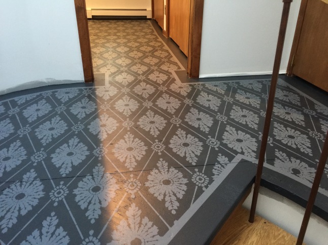
Previously I had made a painted border, and I wanted to again, because I think it looks more complete with one, but I was intimidated by the idea of taping a curve.  Whether this room would end up with a border or not was up in the air until I actually attempted to tape.  It wasn’t bad at all with just a bit of care and finessing.  I was rather proud of myself!  😀

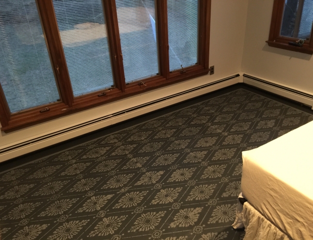
The navy had an entire holiday weekend to cure before taping and stencilling.  I only eyeballed the distance from walls and tried to account for projecting bits of trim to balance with the baseboard heating units.  No portion is perfect, but I am entirely pleased with the results.

It was at this point that I considered switching to grey for the outside border, but I’d not trimmed the tape or planned for that.  The navy matches very well with the bits of carpet on the stairs too, and that helped me decide to keep it as the main colour.  So, another line of tape was added within the perimeter of this.  Just look at this!  So proud!  😀

Before quitting for the day I wanted to complete the border by brushing on the navy to seal the edges and then two coats of the grey.  I peeled up the inner tape before anything dried too much in hopes that it wouldn’t lift any layers that weren’t supposed to.  Success.

In the kitchen I’d measured and begun the pattern symmetrically, because the room was narrow.  Here I decided that the most important focal point was the space between the entry door as one walks up to the landing, so I began there.


This is how far I made it the first day:

And finally I was done late on day two and just barely with enough paint in the tray for the last bit:

img_9577

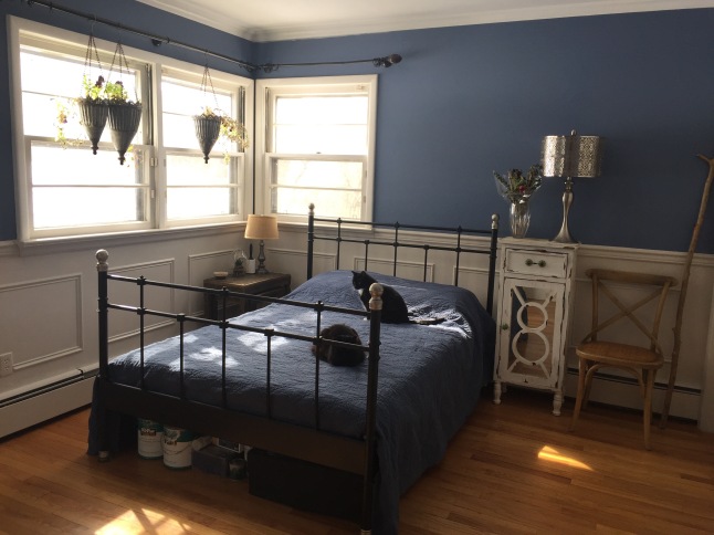
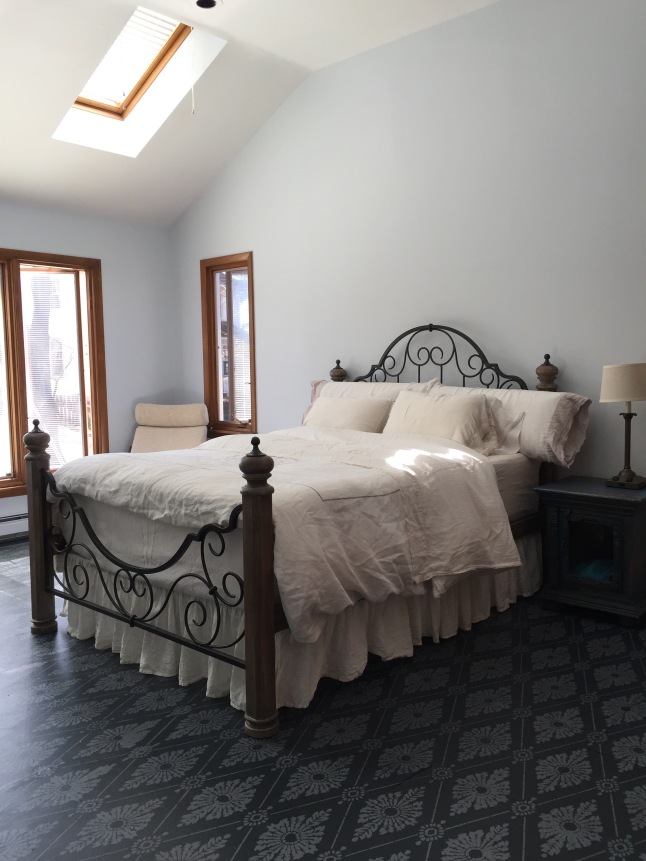
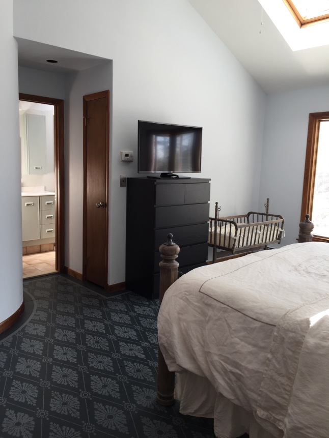
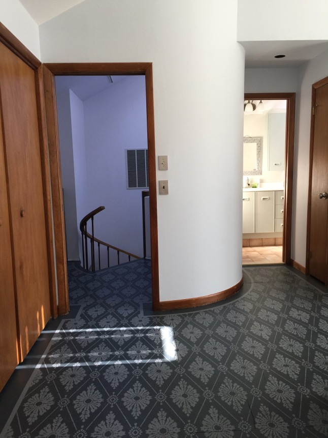
Working on a much wider room was a challenge, and I had a difficult time keeping the pattern on track.  It isn’t perfect, but I’m still quite pleased with everything.  Here is the tour starting with the landing:

img_9553

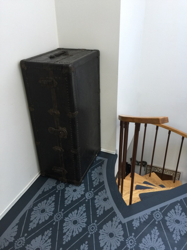
Standing in the corner is one of the steamer trunks that my paternal great-grandfather used when he left Slovakia in 1900.  Each of my uncles has one or two, I’m told, and my parents had two but kept this “uglier” one in the damp basement (and mum painted the “nice” one, sigh.)  I rescued it a couple of years ago, washing and waxing away rust and mildew and treating the leather, but the bottom (back here) is falling apart.  😦  It is a fairly awkward item to keep around, but I don’t want to lose a rare bit of family history, and so here it lives.

Last fall I scored an older one, with at curved top, free from a neighbour after it didn’t sell at their yard sale and about to be tossed!  It is also in less than excellent condition but has a nice look with neat metal reinforcements at the edges and lovely bare wood. I’m going to let it dry out this summer then preserve it.  I’ll be sure to write about it here.

img_9591

img_9595

img_9598

img_9600

img_9602

img_9610

img_9665

img_9641

img_9659

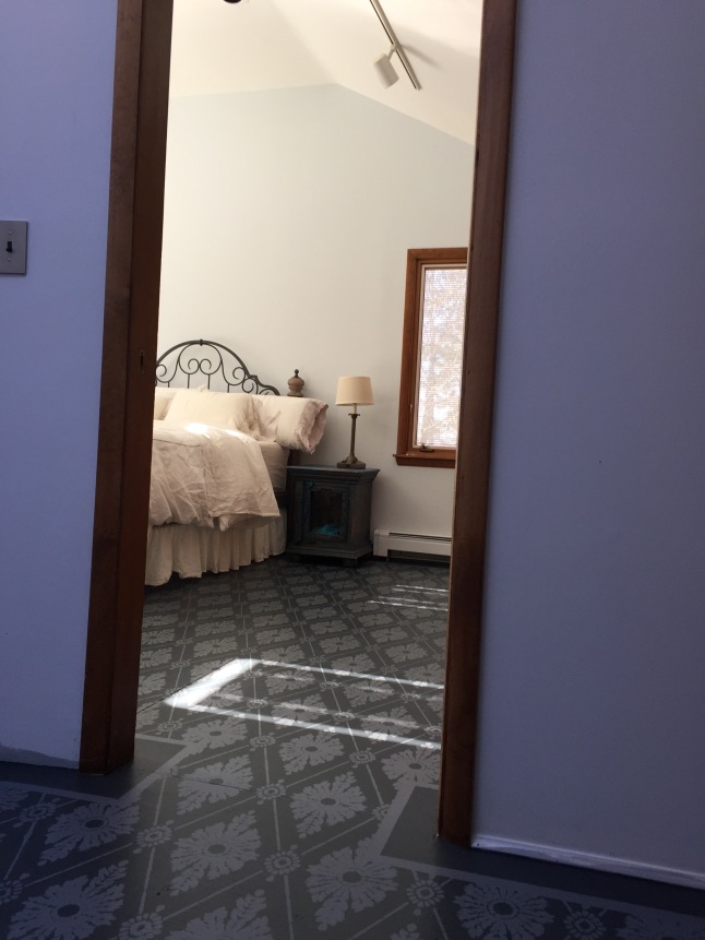
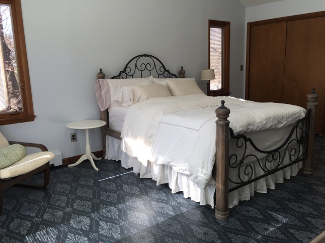
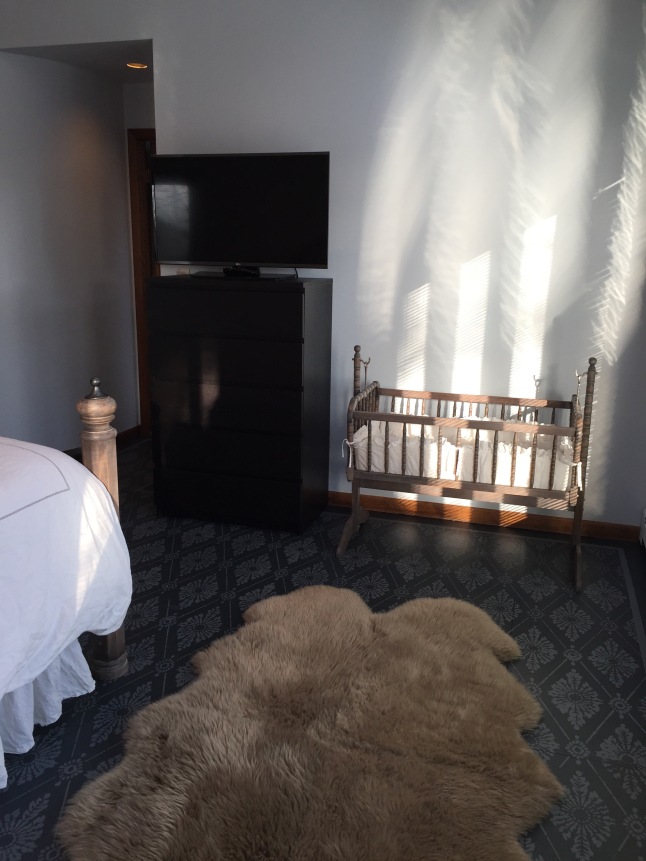
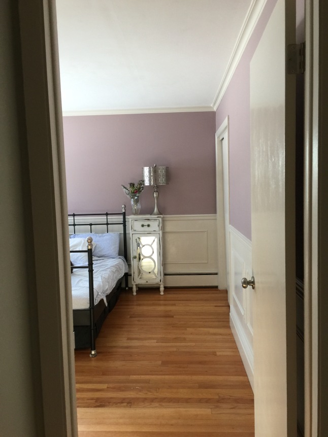
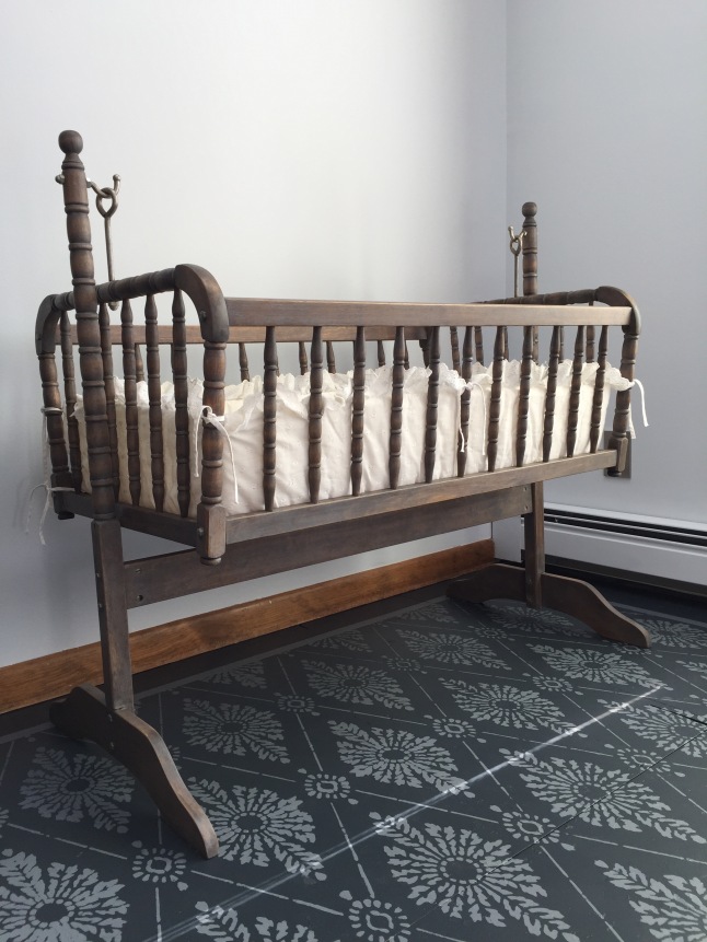
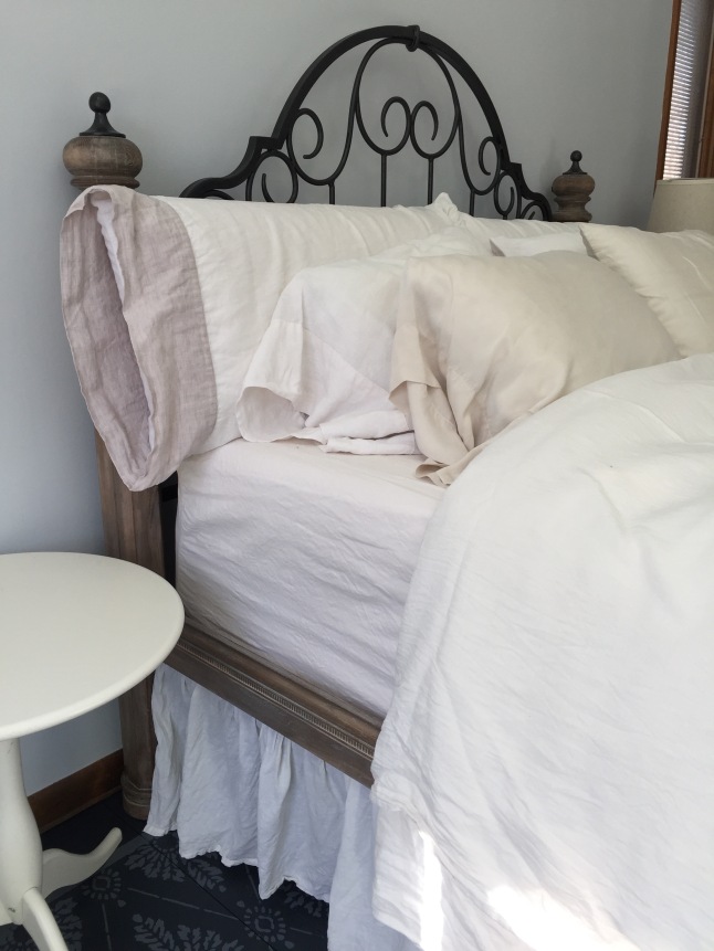
For the photos I decided to set up the cradle that I refinished to match the bed (which I also stained and waxed to have a greyed Restoration Hardware look.)

img_9622

img_9623

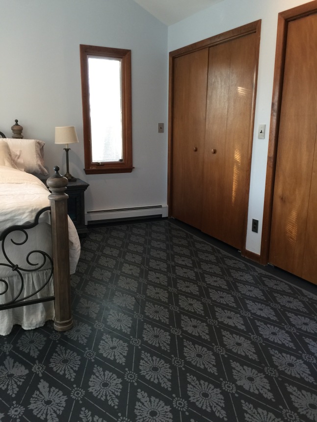
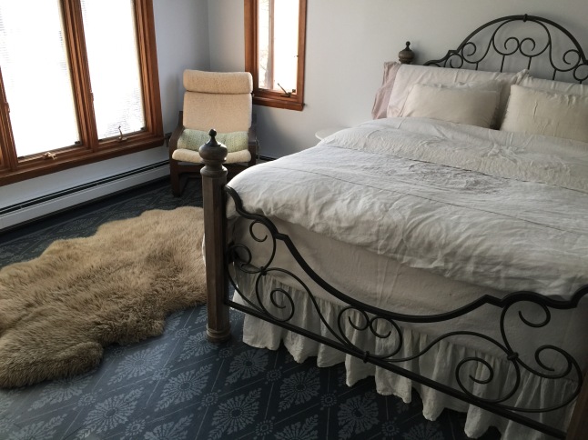
L and I are much happier now with the room and feel like it finally has our style.  I’m also glad to be rid of the dust-trapping aspect of carpet and look forward to a much easier time when vacuuming.  The only thing that I might do something about are the closet doors and trim colour.  It would be a pain, but it could be worth gel-staining the wood to a darker tone?  I’d really like to paint it but think that would be a shame to do and will not, but a deeper shade could make a big difference.  The trim already looks significantly better here than it used to having been touched up to hide strange fading and wear.  As for the doors, they are loud and feel flimsy.  Depending on measurements I could rig up some Ikea PAX sliding doors or something one day?

Next I’ll have to finish painting the bathroom.  Colour goes a long way, and paint disguised the nasty formica-like vanity, but one day we hope to renovate it.  I’m sure that will be many years from now if ever, but it doesn’t stop me from envisioning marble tile and some sort of wonderful tub.


Here and There

Hello again!

I really should have written about the tiling that I was working on in December while I was at it.  Why did I convince myself that projects must be complete before I could post?  All that leads to are delays, and it is silly considering that all the blogs that I’ve most enjoyed reading all seemed to be progress posts rather than complete and perfect before & afters.  Speaking of, I recently found a really enjoyable blog, written by a talented and impressively productive lady, while researching for a future project.  It took me forever to click through to begin reading at the first post, so you’re welcome for the link to it.  😛  (I don’t know about you, but I have to start at the beginning when I find a great blog.)

Just after my last post I did grout and finish the hearth and entryway.  (Although I didn’t seal it yet, now that I think.  Whoops.)  Photos were taken, and there will certainly be a post about those coming up.  Aside from that we enjoyed the holidays, and I was focused on frenzied sorting and organising of all the things before succumbing to 1st trimester exhaustion.  I’m still fighting it, to be honest, and I don’t think that the dreary winter weather is helping much.  Sporadic project-ing does happen, but I could use some energy.

Yesterday I caulked crown moulding in the guest  baby’s room and edged the ceiling.  Rolling on the paint was too much, however, although I re-coated the hallway where water had leaked months ago.  At some point before Christmas I pulled all the furniture to the middle of the room and brushed one coat of Coconut Ice trim paint onto the wainscoting.  Slowly I’ll get there.  Now the dilemma is whether to paint the walls with the colour-matched dark blue (that I already purchased) or go light and bright, perhaps with the Polished Limestone that I have on hand?

This is a difficult choice!  First of all, I already bought the blue.  It is a lovely shade that matches a bedspread and picks up the blue in some heavy linen curtains that were finally put to use after being found at a thrift store some years ago.  It has character and cohesion.  …But it is soooooo dark!  Our entire first floor is done with rather extremely dark shades of paint, and the light does get sucked right into the walls.  It would be lovely to have and airy room on cloudy days.  …But the pale grey is so neutral and boring comparatively!  Sure, it is a lot more “nursery,” but it feels like giving up.  Heh.  Yesterday I asked DH about the situation, and he surprised me by not jumping at keeping the blue.  I thought he’d be all for it since it is his favourite, but he even suggested choosing something entirely different.  Perhaps?  Such a shame to lose that blue though!

This is not the most helpful photo, but I was laying on the bed tired and just wanted to get a shot of the two colours.  The colour-match may read a little differently than this, I believe, and Polished Limestone can be seen in the hallway beyond the door.  Disregard the need for at least one more coat of the trim paint.  😀

Anyway, this will be a long series of progress posts for the nursery, I am sure.  I already plan to move the bed to fit a crib, and the dresser will be stored indefinitely.  I love it, and it was a Salvation Army bargain which I felt lucky to find, but it doesn’t store very much and is delicate.  I used to have one handed down from my mother that is much more suitable, but it has been stored in my father’s basement for a few years.  The condition is questionable.  Once I refinished it and would love to again, but I’m afraid paint may be the best case scenario now.  At worst I have to find one on Craigslist and figure out how to get it home or resort to  Ikea.  (I realllllly don’t want to do Ikea.)   Due to the placement of windows, closet, entry and bathroom doors I don’t know whether I can fit a recliner/glider into the space too.  Gliders are wonderfully comfortable but mostly ugly and always expensive, but I have a thrift store recliner in storage (and pieces.)  It needs refinishing and  reupholstering, again, because the cats shredded the fabric the first time I did it.  Also a nicer fabric would be ideal, but the one I planned to use isn’t in stock (now that I waited a couple of years before buying it.  Unfortunately upholstery fabric isn’t cheap, so…)  I can only hope it will be available again and soon  or else the recliner is doomed to sit in pieces for years.  😦  Planning a real makeover for the nursery could be fun, but I’m not sure I’ll go for a full leap.  The kid is sure to love navy blue and Jacobean floral curtains, right?  Right?  What I do have so far is a lot of linen crib bedding that I scored at the Restoration Hardware Outlet during big sales.  It is all shades of grey and white.  The crib is iron, but I don’t know yet how I want it finished/painted.  Perhaps just clear coat over bare metal?  Boringly safe white?  Decisions!

Lately I’ve been dreaming of spring and have been making garden plans.  Today I placed an order with RareSeeds, and I bought a montmorencey cherry tree too.  We moved to this house two years ago this week, and that first spring I planted a tiny cherry tree thinking the sooner the better if I ever wanted to eat any fruit, but the poor thing died right away.  Last year I told myself not to bother and be glad not to attract more critters, but now I’d really like some tart cherries to look forward to.  I have fond memories of eating them straight off the tree once at a relative’s house (she had an amazing garden) and this pushed me to go for it so that our child can pick cherries in our back yard.  (If I can get the thing to live and grow!  I opted for the more expensive one instead of bare-root hoping to improve my chances.)

The RareSeeds order is basically for decorative stuff that was in the goth garden already, but I added some beans too.  A few of them are gorgeously purple and will be part of the decorative garden.  This year I’ve decided to make use of the somewhat sunnier front of the house more ambitiously.  There is no water source, however, so I’m thinking of ways to extend soaker hoses knowing anything out there is otherwise doomed.  Some of the beans should be pretty there, and perhaps I’ll try a few tomatoes and watermelon?  Last year the tomatoes were a dismal failure since we are so shaded by neighbouring trees, but I desperately want home grown tomatoes if nothing more!  I was working too much and think they were not watered enough either, so my hope it that more attention will make a difference.

A Big Project: Staining Wooden Siding (what have I gotten myself into?!)

img_6095

I got myself into a bit of a mess of a project, and there is nothing to be done except somehow complete it.  😀  With luck there will be enough dry and warm days to do so.

Our house has wooden siding.  The newest section was a kitchen addition/expansion off the back, and there is plenty of life left in the stain on it.  However, the rest of the back is only passable, and the front is weathered badly.  Many spots are silvered wood instead of stain, and somebody was too aggressive with a power washer before we bought the place.  Time to stain!

Foolishly and optimistically I decided to DIY.  Last week I power washed and even lugged the washer up onto the roof to get the worst sections cleaned up there.  So far (and I’ve only put in about five hours, really,) it isn’t awful, but I am pretty sure already that next time this will be a pay-a-professional sort of job.  😀  Honestly, it has been perfectly pleasant so far, but realistically I expect severe regret to hit at some point in the next week or two.  I’ve only finished one section completely and a few boards in another.  The going is slow.  I’m also waiting for a 32′ ladder that will not arrive until next Wednesday.  Drat!  I have no way to transport one, so I went with Amazon for the quickest shipping and best total price, but this Prime item required more than the usual two days… and I’d not counted on that fact.  It really sucks, because this week until Saturday is the best weather for staining.  I can only hope more dry groups of days will be in the forecast.

Once it became clear that I’d really be tackling this project my husband asked me “what colour?”

It was an easy choice to go with the current stain colour.  The previous owners had left us a handy reference can, and I always thought that the colour was pretty great.  I’d describe it as a red: a rusty-orangish-terracotta-slightly-brownish-red sure… but basically a red.  It perfectly fits the house which is a 1960 “contemporary,” according to the real estate listing.  With a large grid of windows, some brick; too many front steps, stone, and masonry “features” in the front; and two major additions that transformed it from some sort of mundane ranch to something less easily categorised: the interesting but somehow neutral brown-red worked.  To the eye the siding colour and brick melded attractively, and nothing competed for attention except for the sad expanse of foundation  lifting the structure above the hillside.  (The cinderblock steps and front foundation were enhanced with a parge coat and topped with bluestone.  It looked gorgeous but wasn’t done properly, and now is it spalling and crumbling apart most hideously.)

Why change such a well chosen colour?

We like to take walks around the neighbourhood and judge discuss what we like and don’t like about the houses and landscaping that we pass by.  Sometimes there is a detail that I’d like to copy, and sometimes we laugh that you just cannot account for personal tastes.  Near us there is a stunning home.  It’s a stuccoed Tudor style probably built in the ’30s, and it is painted a vibrant red.  The area has quite a few similarly styled homes, but the colour makes it shine like a jewel set in the towering dark pines of their yard.  It is cheerful.  Even on cloudy days it seems there is more sunlight there, and we both love the red.  So, when I went to the local hardware store to have some Arborcoat mixed up, the old can’s tint formula in hand, I hesitated.  Instead of having the lady there send me on my  way with a few cans of the terracotta hue I said to her “you know, I had planned on keeping this the same, but I think my husband would really like a brighter red, but I don’t know…”  She replied that men usually do seem to prefer louder colours and eventually she sent me home with a couple of sample jars: Redwood and Barn Red.

Immediately I liked the old terracotta when I brushed a fresh swatch of it near the front door.  The barn red seemed… really red.  Wow.  Okay… Lastly, redwood struck me as far too orange without a second thought.  Later L. came home and didn’t hesitate to exclaim that the red was awesome, and that barn red it would be.

Oh.  Uh…  I wasn’t so sure.  His selection caused me a lot of angst over the next day or two.  I brushed more samples in other areas.  I sent photos to my mother for her coworkers to vote on.  It was driving me crazy.  For the record, my mother was also leaning toward the terracotta, but all the votes were enthusiastically for the barn red.  I went back and purchased a few gallons mixed as barn red, and the guy who mixed it responded that it was a nice colour and “welcome to 1950” when I expressed concern at the change and brightness.  That night I actually had bad dreams about the decision!  On Sunday we went sailing with some friends, and at some point I asked their opinions as I related the dilemma.  After seeing photos they voted barn red, and I was glad when they began to tell us about a really stunning red house up the block… the same one we’d been so fond of too.

So, I began staining on Tuesday.

I haven’t gotten terribly far yet, but I’ll admit that it does look quite nice after all on the end of the kitchen with French doors that I did complete.  I’m really enjoying the Arborcoat solid stain and how well it goes on.  It is my first time using a Benjamin Moore product, but I always appreciate a stain or paint that is a pleasure to work with, and luckily the Aborcoat is very nice indeed.

Now I have to get back to work on it.  I’ll report back with progress (or when I’m done,) and about other things that I am working on.  I’ve also been fixing up our windows with fresh paint, re-glazing, pretty new sash locks, and re-furbishing/removing the old storm windows.  Any days that aren’t suitable for staining have plenty of other work to fill them. Oh, and I did a temporary facelift on that crumbly, ugly front foundation and steps.  That isn’t complete but already looks much better.  I just don’t know if it will last until spring or whenever we can have a professional repair it solidly.  For that I cleaned the crumble, patched with Quickcrete (until I ran out,) and rolled on a coat of Behr foundation paint.  I still have to finish the patching, paint the edges and corners, and roll another coat, but it looks so much better.  The best part is getting rid of the pale, bluish paint that clashed jarringly with the rest of the place.  The clay taupe-grey that I selected in-store worked out great.  I took a risk in grabbing two gallons without seeing a colour chip at home, so I a pleased it worked out.

Here are a couple of shots that show how nicely the terracotta matched the reddish slate stepping stones:

And here is a reference photo of the front of our place from the street.  It was taken last fall:

front-photo-from-last-fall-2015

And then the masonry mess:

And a bit after with the paint.  I think the darker shade is far better:


Compare:

Before and After: the Living and Dining Room

Slowly I have been painting and making changes to our new house, and I’ve talked about it without sharing as many photos as I’d like.  Not many rooms are finished yet, in fact at least some details remain to be done in every one, but the living/dining areas are complete enough to show off the general transformation of drastically different paint colours and such.  Here are a few After shots:

living room after toward lounging area and desk living room after after dining area

And Before:

living room before 1 living room before 3 living dining room before living room before 2

dining area before fireplace beforecolumn in living dining before living room corner before

Before painting the walls I spent a lot of time on fixing small details that end up having a big impact.  Unfortunately I did not remember to document it very well.  First thing, I took down the “column” dividing the dining area from the living room.  Swapping out the almond coloured plastic switch and outlet covers is something quick and easy, but I also have begun to change the switches to Decora style in white/black too.  (Annoyingly I haven’t finished doing this, because it is a pain to run up and down the stairs testing which circuit things are on or I don’t want to accidentally turn off my computer, the washing machine or some other appliance at that time.)  For now I simply rolled paint over the outlets (without the cover) to make them look a bit better until I get around to replacing them.

Instead of plastic we like these brushed nickel cover-plates.  Home Depot used to have nice ones but no longer have the finish I want.  Luckily Amazon has them, and I can get every configuration I could possibly need.  They even have dimmer knobs!  Another really cool thing that I found browsing in the electrical aisle were things to make in-wall coaxial cable connectors and phone jacks work with Decora style cover-plates.  I used to prefer the old style of outlets, but I am beginning to see the ease of having Decora throughout a house so that any single gang cover-plate works on any outlet, switch, or more.  That said, I would love the really old fashioned push button switches if I could have them.  In fact, I just found this cover-plate that could be used by our entry door!  This may just have to be added to my long term to-do/to-buy list!  The door handle and lock are the same kind of dark bronze, so it would look nice.

I also switched out the wall sconce in favour of a less traditional style in brushed nickel and frosted glass.  It was actually one of the cheapest options, but I liked the shape better than any of the others I saw anyway.  Win, win!  It reminds me of a candle holder from some long past time although it is technically a fairly modern style fixture.

A more important detail to take care of before painting was to caulk and patch every last crack, hole, and crevasse.  Doing this is key to improving the look of a room, but admittedly I didn’t know about caulking until pretty recently.  The difference made by filling in all the gaps along the crown moulding is really impressive.  I should have taken some photos focusing on this before starting, but I totally forgot.  It is not very easy to spot in the Before shots, but you can find some examples, and I hope that the After photos show a more solid and finished looking home.

Some in progress shots:

painting living room entry area painting dining area (and OMG mess)

I am sooooooooooo glad that the moving mess is mostly over.  Just looking at that second photo makes me anxious!

The previous owners painted the fireplace brick wall white and told me it had been a multicolour sort of brick.  To freshen it up, and for continuity, I repainted using the same mushroom-y, warm, off-white, “coconut ice” colour which will be carried throughout on most of the trim in the house.  Between the brick and drywall there were gaps ranging from barely there to well over a centimetre, I caulked it all, and it looks much better now.  I also took down the mahogany mantle.  I felt badly about it, because the previous owner had a nice story about her father bringing it from the airport and installing it, but it was such a traditional style that didn’t seem right to me, added a wood finish that was hard to decorate around, closed in the room somehow, and was a “stuff” magnet to my husband (what a great place to set down all of my things!)  😉  It is being stored though; just in case.

fireplace after fireplace after removing mantle, changing light, and painting

I am not quite finished painting in here.  The built-in shelving area must be touched-up before I can install the last bit of hardware, and the shelves should probably be painted.  I suppose I’ll go with “coconut ice,” but I haven’t decided if that will stick out terribly.  I’m still pondering the options.  Meanwhile all of the windows have only been primed and await their coat of “coconut ice.”

In the dining area, living room, and the hallway I didn’t want to call attention to the baseboard trim or have pale doors to the coat closet and cellar.  Thus I chose a grey even darker than the walls for them.  At first I intended to use a glossy formula in the same colour as the walls, and I probably should have stuck to that, but at the last minute I chose the only shade offered that was darker.  I did that in the store without even knowing for sure how well it would work, and although it looks as intended it probably would have been a bit nicer with just the glossy version of the walls.  I do like how the baseboard heaters no longer pop out, but one day I may re-coat all of it.

A Full Day to Edge; an Hour to Roll.

I am so glad to be done!  *Not really done, because all the white is only primer which awaits the “coconut ice” that I didn’t have time to brush on before the party this weekend.

done hoosier area

Yesterday I had a loooong day.  My back was nearly spasming which made it extremely difficult to work on anything.  The plan was to paint the kitchen and hopefully do some other to-do list items too.  I spent the entire day painting the edges of the kitchen, but I didn’t have a chance to do the rolling.  Today my back is barely any better, but I did the walls.  It looks pretty great at least.  My husband LOVES the shade of red, and I like it a lot, but I’ll admit that I had a lot of remorse about losing the sea-green.  I kept stopping to dwell on regrets, but there was no going back.  Since my husband despises green there was no keeping the old colour anyway.

done clock and vlad done old kitchen area

I do adore that red, but it is very different look than the sea-green.  The kitchen is our style now and the colour dramatic but… dramatically less light is bounced around too.  😉  I used flat, and it went on so gorgeously; covering with one coat.  It has such a great velvety appeal, and I need to remember to check if the paint was nicer (more expensive) than I usually select or what.  All that I recall offhand is that it is called “new brick.”  I saved the lid from my kitchen two apartments ago, and this is the fourth kitchen that I’ve used it in if you count my mother’s.  Every other time I chose eggshell, but the flat is freaking fantastic.

Here is some of yesterday’s progress:

edging kitchen edging edgin old part of kitchen

The last one shows the sea-green best.  You can see the huge difference?  The red just sucks in all of the light.  Both are gorgeous colours, but very, very different.

I also re-painted the dining area and painted the built-in shelving nook there too.  Weeks ago I already painted the living-dining room, but I knew I would run out of paint.  Foolishly I didn’t pay attention to the formula beyond having the chip and that it was flat.  I did mix the old and new, but not before painting a couple of walls.  The sheen was not even close in spite of both being flat from the same store… of different formulas (same brand.)  It caused me to have to repaint all the edges back then and today the the odd walls.  I will not be making that mistake again.

dealing with lazy work painting nook done nook again done nook

Lastly, I switched outlet covers from almond plastic to brushed nickel and also the hinges of the pantry door.  There is so much left that I hoped to do besides painting the trim and bead-board (not happening) before the housewarming party tomorrow.  I have to go to Home Depot and to buy food/beverages still.  Tomorrow is Big Cleaning too.  I’m so tired.  Having the party as a goal helped me get as far as I did, but as a control freak it irks me to have so many details unfinished.  😦  The perfectionist side of me has kept me from attempting more work than I could do my best at.  😀

hinges

Yesterday  I saw a few sprouts in the trays that I started.  Yay!  I have a few more to do next week, bulbs to plant, and plants to find homes for.  A few were delivered a day or two ago, but the areas I planned to put them in were solid granite just under the surface.  Crap.  It is snowing right now anyway.  (Go away wintery weather!)  The week after next my friend, mentioned in the gardening post, is coming to visit, so maybe she’ll get me sorted out with where to plant things?  For now I’ve decided to put most of the bulbs in two containers to make it easier.  Those were the most cost effective I could find.  I’ll drill some holes, and they should be fine?

Alright, I need to go…