Another completed Alabama Chanin style piece (and a sneak peek of what’s in progress now.)

IMG_1195

I finished this a few weeks ago but couldn’t post about it until I’d presented it to the recipient, so first I’ll ramble a bit about the other pieces that I’ve begun since and will be posting about:

Yesterday I traced out and drafted a little bodysuit pattern for Mini in her current size.  It has spaghetti strap shoulders for the upcoming hot weather, the usual onesie shape, and an optional overskirt.  It was based off a sleeveless bodysuit that I really like but without a ruffle flutter sleeve, and then I added the overskirt from another dress waiting in her closet.   I began a 12-18m size too, but then I thought I better test the smaller pattern first.  If it looks good then I might do another pattern adding to the chest area and giving it long raglan sleeves?  With the overskirt it takes a very large T-shirt to fit all the pieces, so I couldn’t use the first pretty colour I hoped to… or the next seven.  Oops.  Finally I found a large enough shirt in a colour that made me happy and cut out all the pieces.


Before that I’d been sewing a little every day to make a Mini sized test version of my wrap dress.  I wish so badly that I could already dress in all the things I plan to make.  If only I could!  There are long, elaborate, and flattering A.C. dresses and skirts; full linen skirts topped by slim singlets or flowing tunics; cloak-coats; layers of harem pants or skirts with draping hems of wrap tunics and scarves; long wrap dresses…  I want to dress like this and feel comfortable, but alas it would take ages to complete (especially any elaborate and long A.C. clothes!)  Instead I can make a piece or two for Mini each month.  Eventually I hope to make a few of my wrap dresses in knit, but I need to test the pattern first to make sure it doesn’t need to be altered for the difference in fabric type.  Making a little dress is so much faster, less a waste of material, and as a lonely bonus leaves a nice dress for Mini to wear!  Wonderful!

For several days now that little dress has been entirely done… except that I still need to fell one long seam.  It is ridiculously close, but I’ve chosen to begin other things when I had a little time for sewing.  Today or tomorrow I’ll complete it.  I’m very pleased with the way it turned out, but it is probably too large for her to wear yet?  Oh, and I used the leftovers of a T-shirt from the project I’m supposed to be writing about now.  I only purchased pink for that reason, but I actually like it now and may look out for more.


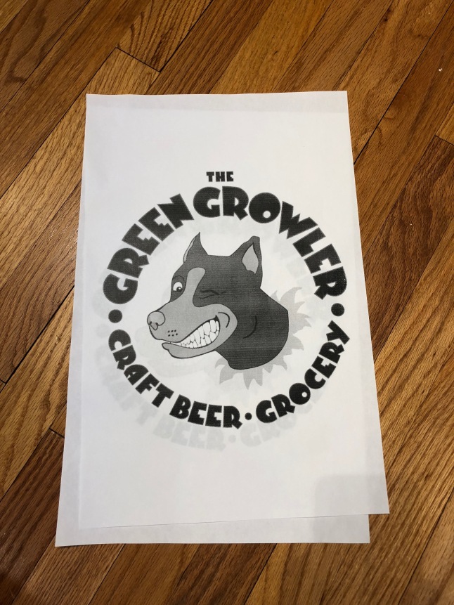
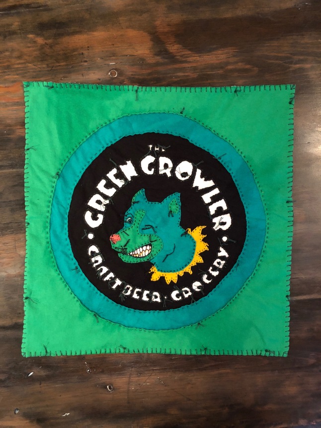
On to what I meant to post about: One of the first things that I thought to make when I was getting the hang of A.C. techniques was a little gift for a friend who owns our favourite local pub.  She encourages the arts and has a lot of cool artwork displayed and decorating the place, and I’ve never had anything that I could contribute until I thought of making a tapestry piece.  Perhaps I could have been more imaginative, but I simply copied the bar logo and carefully made stencils from it.  (I just cut bits out of the paper with an Xacto knife and trace with Sharpies.)

IMG_1378

I went to the thrift store to find the right colours in men’s t-shirts, and it was lucky there were any left at all in greens unfortunately, because it was at Saint Patrick’s.  Oops.  I did find two in about the right shade though.  I only needed a tiny piece of pink for the nose, so I had plenty for that little dress.  There is a bunch of mustard yellow to use too, so I had better begin to like it better heh!

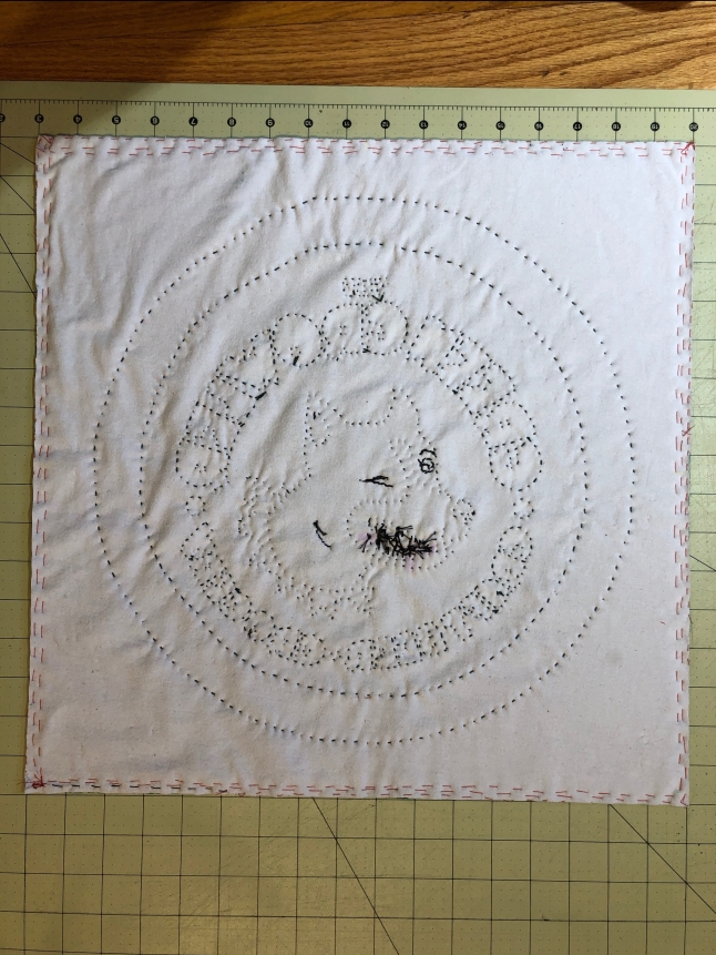
A bigger stencil would have been far better for all the detail and stitching, but I couldn’t enlarge it any more on one piece of paper.   T size of the t-shirts also limited the dimensions of the square besides.  I started by determining that base size on the white and black under layers, basting at the eventual cutting point, and basting around the area to stitch.  Then I used a silver Sharpie to trace out the words before stitching them.  The logo has a little green around the letters, so I used green thread, but you can barely tell it isn’t black.  I decided to embrace the knottiness throughout the piece (except in a few details later.)  At first I was going to have a white background like the actual logo, but I didn’t like how that would look with fabric or to think it may eventually turn dingy.

IMG_0849

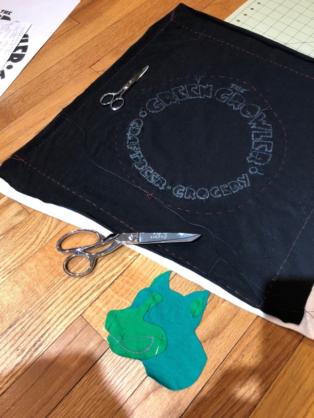
Then I cut the green layers and appliquéd them.  The yellow layer was next, but I decided to unpick the green a little to allow placement behind rather than over as I’d first planned to.  I switched to black thread to mimic the logo.

IMG_0906

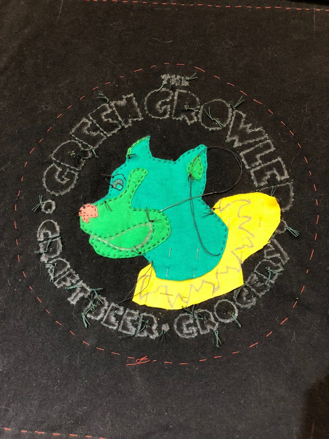
Then it was time to cut away and reveal the white!  I traced out the teeth with chalk, but it didn’t wash away even after a few rounds.  Shoot!  I had to leave off the knots in the teeth and select other portions of the backstitched details to keep it from looking like a mess.


IMG_1088

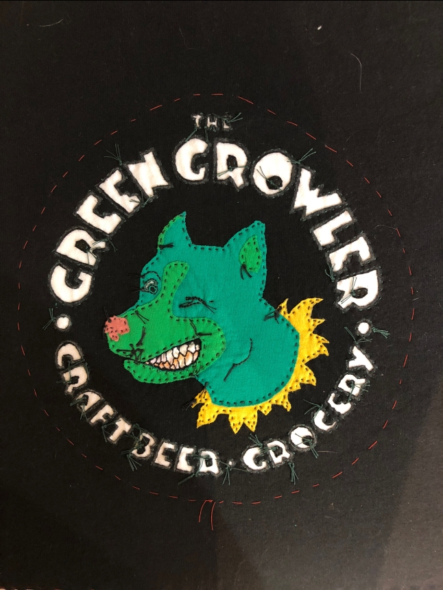
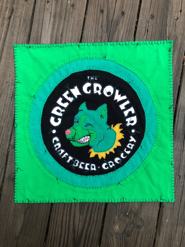
Getting there!  Time to make circles…


IMG_1192

… and to finish with a blanket stitch and DONE!  It took forever and a day (late March until June!)

IMG_1199

In progress: painting a vintage Wonder Horse (Bouncing rocking horse)

Well, that was fast.

After posting this morning I managed to do some chores and spend time spraying the horse.  I started with medium grey (metallic) over the primer covering everything as a base.  Then I used the darkest grey (metallic) focussing on the muzzle, underbelly,  hind quarters and lower legs.  Finally I sprayed pearly white using cardboard scraps to mask the areas I wanted left dark.  Holes were cut to stay the dapples.

The dark layer went well and so did the white initially.  I was really happy with the dapples and look.  Then I thought “I’ll just add a little more…”

Shoot.  I did not take photos at the point, but just as well probably since it would only remind me.  I wasn’t pleased by the time I sprayed a little more.  Meanwhile my little one was getting sick of her play-pen inside, so I rushed on, took breaks, and rushed through.  I believe I’d have had different outcome if able to focus the way that I used to.  😉  Anyway, I left it to dry all afternoon and was somewhat more pleased when I saw it again.  Yes, the dapples were all but lost, but it still looks good if you didn’t know my original vision for it.  The white paint has turned into a very silver metallic that blends too much with the other two shades, and that is part of the dapple problem.  Again, it is pretty enough if you don’t know the intended look.  It seems that a rather aged and then polished iron kind of  style won out despite my plans!

During the afternoon I dug around the mess of our attic (my fault!) to find the little bottles of paint from the Borg Queen costume after not finding them in the basement paint storage area or in the sewing room.  They were in the attic, and I did find them eventually, and that is a win given a poor streak of luck I had the past few days.  (I wouldn’t have purchased more, because I already did that for the last Borg Queen when I couldn’t find the original paints!)  So next I’ll either enhance the details on the mane, tail, and tack with these paints and tiny brushes or I’ll detach the stand and spray that.  Tomorrow we’ll have some rain before clear weather again, so that and life may delay this.

Ideally I’d maybe like some blues or other colours in the saddle, but I have only copper, silver, black (spray,) and gold to work with.  Unless the project is delayed and I suddenly go shopping then those are all I’ll be using.  It already looks pretty nice as is and could certainly stay without any additional work.  Perhaps, but I don’t think I can leave well enough alone.  That would be too easy!  I still might mask off the horse fur area after today’s paint is cured and spray the saddle a flat black first?  I don’t know.

Here it is with the dark layer:

IMG_1428

and white:

IMG_1434

Dried later on and in different lighting:

IMG_1444.jpg

Closer:

IMG_1448.jpg

IMG_1447.jpg

IMG_1454.jpg

See how metallic silver it appears rather than pearlescent grey and white?  Notice that the neck area no longer shows the dappled paint I’d done?  Oh well, I suppose…

Let’s not forget before:

IMG_1152


Re-making Vintage Prams & Strollers Part I: a Hedstrom Bassinet/Carrycot

This is something I haven’t really found anyone else writing about: re-making/re-covering/re-upholstering old prams.  Although in researching them I’ve found some bloggers using older prams for their kids I haven’t seen anyone take one apart to revamp it with new fabrics.  That kind of surprises me!  Today I’ll talk about the first pram that I re-made, and then I’ll be posting about an ongoing project that I’m excited about.  The new project is unfortunately going to be subjected to delays thanks to lack of materials on hand and the impending arrival of Mini.  (She was due this past Saturday and is being evicted one way or another before this weekend.  While I’m very excited I’m also worried about ever finishing the newest pram!)

Prams and strollers/pushchairs, vintage or not, weren’t on my radar until I spotted an old Hedstrom in one of my favourite thrift stores a few years ago.  I didn’t need it.  I hadn’t known I wanted it, but once I found it; I did.  😀  Sure, I hesitated while the more sane part of my brain tried to win, but I kept pushing around the store as I browsed, it was only something like $10, and soon it was going home with me in hopes that we’d be making use of it some day.  I just liked how it looked, all metal and old fashioned, and I thought it seemed practical with the detachable bassinet and gentle rocking motion.  The fabric wasn’t so lovely and a bit crumbly, but I knew I could either clean or fix it up.  Once home the frame polished up nicely, and I began Googling old prams.  Right away I decided on using linen to re-make the bassinet, because I just didn’t like the knit navy fabric very well or expect it to last much longer.

543365_10151402842864756_1559025897_n

It was very difficult to select a fabric.  A somewhat lime green was my favourite option with a fairly muted red next in line.  Dusty shades of pink, green, and blue were runners up.  On the one hand I wanted to use a fun colour, but on the other I was afraid to have it clash with my outfit too often and also deferred to L’s preference and used the dull khaki green.  I still have the lime yardage and wish I’d used it instead, because it would have been a much more dramatic change and look, and this has influenced my choices for the new pram project.

150632_10151402843369756_915124798_n

Anyway, I have very few photos on hand from re-vamping the Hedstrom.  I tore it apart completely and jumped in with creating a pattern from the old pieces and re-builidng as best I could.  I had to replace the rivets with bolts and cap screw things, and sadly I didn’t make a matching cover to snap on, although I did include the snaps on the body to attach one.  I’m not sure what happened to the remaining fabric to make the cover.  😦  Everything was replaced except the frames and supports.  I used a fancy vinyl inside and to cover the mattress board.  The mattress support has a portion that snaps up into a seated position, which is nifty, and I made a mattress cover and pillow to match with the same green ticking striped cotton as the hood lining.  I was fairly pleased with how it all turned out.

Here are some recent shots:

Since then I’ve seen other similar prams, and I realised that I was missing more than the weather cover.  Technically the Hedstrom was complete aside from the weather cover, but plenty of other similar prams had seat attachments to turn them into strollers.  Shoot.  That’s far more useful!  Some brands and models are prettier, like the curvaceous and velvety Herlag brand I’ve only spotted rarely, some are boxy and less appealing to me, and some have a bit of a following like Emmaljunga’s “Viking” model.  As with most things like this I became a little obsessed, collected a few strollers, and still ended up crossing the river and a state line to pick up an early ’90s Viking frame, bassinet, and stroller seat set after seeing a particular listing on Craigslist forever at a steal of a price.  (I just couldn’t ignore it and let it go.)

Not the best Herlag example, but I saw a shiny one just like it but in better condition that really looked amazing with the curves:

Oh wait, here is another swiped photo but of the shiny one:

98f60ee7a68820422c02a3232505622b--vintage-pram-buggies.jpg

I took these photos from an eBay listing.  If only I had unlimited funds and space I’d probably get a Herlag too… polished up it would be soooooo gorgeous!  *sigh*  This brand is by far the most elegant in my opinion, and I wish I could trade the Hedstrom for one.  The corduroy inspired me to use velvet for the Emmaljunga to get a similarly rich look if not the elegance.

Emmaljunga’s Viking is the only somewhat popular old stroller people are using out there, as far as I can tell, aside from hard-bodied varieties like Silver Cross.  They came in navy blue most frequently and sometimes forest green or bright red all with white vinyl accents.  Other models had some funky fabric and vinyl options especially in the ’80s.  While you can still buy new hard-bodied prams that look old the soft upholstered kind turned into a modern take before 2000, and it seems that Scandinavians were the last to do upholstered prams that would pass as more vintage to most eyes.  (Emmaljunga is Swedish, and more common to find, but Simo is a similar Norwegian brand with a few American strollers out there from the ’90s too.)

Here is sneak peek preview of the Viking project…  I made a lot of progress today and should complete the stroller half tomorrow.  The bassinet portion will be on hold indefinitely, which sucks, but I don’t have the time or fabric for it now.  Also, I’d banked on using a $15 “donor” seat and bassinet set in order to save and use the red whenever it suited my fancy, but that fell through.  😦  The carrycot is in better condition, so I can’t bear to take it apart aside from the time and materials dilemma.  Either I’ll never end up making the matching bassinet that I envision or it’ll be with a suitable one in poor condition later.  *Sigh*  It was going to be gorgeous.  So, hopefully I’ll get to write after I’m done tomorrow but for now here is the original red stroller and the fabric I’ve used to re-make it:

I do feel terrible about ruining the original red set.  Gah!  All I can tell myself, and you, is that the stroller seat/hood part of the set was somewhat ratty up close… even with a spot or two worn right through.  It was still super cute though, and original!  And I had a red and pink Haba stroller toy thing that matched it so well, and a quilted seat pad too…  Gah!!!  I’ll definitely be keeping an eye out for a replacement if I can ever happen upon one.  (The hood portion is all that I really need if anyone out there has one for some reason.  Well, the bassinet too if I want to re-cover one some day.  Anyway…)

Stencilling a Subfloor: a budget friendly makeover

Ah, this was a project I planned to tackle before we even moved into our house just over two years ago.  How time flies!

img_9598

Perhaps you’ve already read about my first stencilling project?  Well, I knew that the solution to the stained (and in my opinion very unappealing) master suite carpeting was to rip it out and stencil just like I’d done to the apartment kitchen.  I even decided to stick with the same colours  and pattern!  According to the mix information I purchased the paint for this before we even moved… and here I am finally done with it.

I began tearing up the carpet on Monday the 13th thinking that with luck I could be done for the weekend.  Ha!  I just completed it on Thursday and only did so by opting not to clear coat.  (I’d wanted to do everything properly and thus apply several coats and let it dry for days as directed, but that meant not stepping into the room until next week, doing things in stages thanks to furniture issues, plus a lot of work… nah.  It’s good.)

Here is a before picture showing the carpeting.  It seems I did not take many photos of the room before we moved in, and you do not see the brown mystery stains here.  Any shades of tan, beige, and brown have never been my thing, and by the time I finally began tearing it out the carpet had additional pulls and damage.  It was beyond time to go.

img_5290

It was easiest to start inside the closets, and oh look!  A mystery stain!

img_9323

The padding underneath was actually really nice, but it had to go since I wasn’t about to put in another dust collecting carpet.  Annoyingly, previous workers had been rather careless with spackle and paint which left the floor a bit lumpy.  I didn’t want to try sanding anything though, because with the plywood it seemed weird to.

This was a lot of work, and I didn’t quite finish removing the carpet on day one.  I’d begun thinking it was perfect timing to bring the trash out for collection the next morning, and it ended up being 12 contractor bags full at the kerb not counting what was still on the floor when I quit for the evening.  At this point I may have been having a second thought or two.  The were about two million staples to find and pull up!

Last time when I stencilled the apartment kitchen floor I neglected to prime first.  That was not to be skipped now!  When I was nearly done brushing it on I noticed that the can said it wasn’t meant to be used on flooring.  Oops.  Perhaps it would have been better to stick with only the floor paint after all and no primer?

It looked a lot cleaner after priming anyway.  The next day I brushed on a few coats of the base colour.  In the apartment I’d regretted having the edges dark since it showed dust bunnies too well, but I ended up doing the same thing here with the navy blue exposed at the edges.  Actually, I was very close to switching to the grey except that I’d already completed the cutting in and taping for the navy.  In the end I suppose it works out better in this case to have the darker one at the edges to disappear better under the heaters and disguise imperfections?

I filled in most gaps which included rough cuts around doors and a lot of gaps in the landing area.  I’m unsure why they never installed any trim there and had to add some myself.  I really don’t like quarter round and always opt for cove moulding instead.  Rather than wood I used the foam stuff thinking it would curve with the “tower” wall, but the piece I had ended up snapping around a nail, so I filled the wide gap instead.  Eh, it works?

Previously I had made a painted border, and I wanted to again, because I think it looks more complete with one, but I was intimidated by the idea of taping a curve.  Whether this room would end up with a border or not was up in the air until I actually attempted to tape.  It wasn’t bad at all with just a bit of care and finessing.  I was rather proud of myself!  😀

The navy had an entire holiday weekend to cure before taping and stencilling.  I only eyeballed the distance from walls and tried to account for projecting bits of trim to balance with the baseboard heating units.  No portion is perfect, but I am entirely pleased with the results.

It was at this point that I considered switching to grey for the outside border, but I’d not trimmed the tape or planned for that.  The navy matches very well with the bits of carpet on the stairs too, and that helped me decide to keep it as the main colour.  So, another line of tape was added within the perimeter of this.  Just look at this!  So proud!  😀

Before quitting for the day I wanted to complete the border by brushing on the navy to seal the edges and then two coats of the grey.  I peeled up the inner tape before anything dried too much in hopes that it wouldn’t lift any layers that weren’t supposed to.  Success.

In the kitchen I’d measured and begun the pattern symmetrically, because the room was narrow.  Here I decided that the most important focal point was the space between the entry door as one walks up to the landing, so I began there.


This is how far I made it the first day:

And finally I was done late on day two and just barely with enough paint in the tray for the last bit:

img_9577

Working on a much wider room was a challenge, and I had a difficult time keeping the pattern on track.  It isn’t perfect, but I’m still quite pleased with everything.  Here is the tour starting with the landing:

img_9553

Standing in the corner is one of the steamer trunks that my paternal great-grandfather used when he left Slovakia in 1900.  Each of my uncles has one or two, I’m told, and my parents had two but kept this “uglier” one in the damp basement (and mum painted the “nice” one, sigh.)  I rescued it a couple of years ago, washing and waxing away rust and mildew and treating the leather, but the bottom (back here) is falling apart.  😦  It is a fairly awkward item to keep around, but I don’t want to lose a rare bit of family history, and so here it lives.

Last fall I scored an older one, with at curved top, free from a neighbour after it didn’t sell at their yard sale and about to be tossed!  It is also in less than excellent condition but has a nice look with neat metal reinforcements at the edges and lovely bare wood. I’m going to let it dry out this summer then preserve it.  I’ll be sure to write about it here.

img_9591

img_9595

img_9598

img_9600

img_9602

img_9610

img_9665

img_9641

img_9659

For the photos I decided to set up the cradle that I refinished to match the bed (which I also stained and waxed to have a greyed Restoration Hardware look.)

img_9622

img_9623

L and I are much happier now with the room and feel like it finally has our style.  I’m also glad to be rid of the dust-trapping aspect of carpet and look forward to a much easier time when vacuuming.  The only thing that I might do something about are the closet doors and trim colour.  It would be a pain, but it could be worth gel-staining the wood to a darker tone?  I’d really like to paint it but think that would be a shame to do and will not, but a deeper shade could make a big difference.  The trim already looks significantly better here than it used to having been touched up to hide strange fading and wear.  As for the doors, they are loud and feel flimsy.  Depending on measurements I could rig up some Ikea PAX sliding doors or something one day?

Next I’ll have to finish painting the bathroom.  Colour goes a long way, and paint disguised the nasty formica-like vanity, but one day we hope to renovate it.  I’m sure that will be many years from now if ever, but it doesn’t stop me from envisioning marble tile and some sort of wonderful tub.


Xmas Decor 2016 & List of Upcoming Projects

Yesterday I brought the tree down from the attic, put it together, and decorated.  We were away around Thanksgiving, and I haven’t been terribly productive recently, but at least the house feels nice and Christmas-y.

Actually, I’ve been working on things here and there, like massive organisation bursts, but in the last week and this one not much else could be done.  L worked from home, took this entire week off, we were away, and I’m about to flip out for lack of alone time, so… I’m looking forward to more productive times.  Also, I’m now in the midst of the IVF cycle (number II,) and it is rather inconvenient.  For example, we left for Manhattan well before 7 on Monday and weren’t home until noon.  Thankfully on week days I can mostly go to a nearer location for monitoring, but city trips make for an exhausting day without much hope for large projects.  However, I do have a long list in mind to complete before family visits for Christmas.

Definitely:

-Purchase quartz tile and supplies to re-tile the entry area and hearth.  (Likely to be done this Friday when I go for local-ish monitoring.)

-Tile the hearth and entry.  This would have been ideally done before putting the tree up, but alas.  I am antsy to do this in particular, because it is a small enough project that I’ll get a lot of satisfaction quickly, and it will make a huge change to the look of our place.  Of course I’d like that done before we have the rare occasion of house guests.  (It already irks me that my tree photos now showcase the old tile!)

-Finish sanding the dining chairs before staining and waxing them to match the Restoration Hardware style dining table that I completed at least two years ago.  (!!!)  While I’m at it I ought to touch up the coffee table.

-Brush trim paint (coconut ice) on the remaining 40% of the kitchen beadboard that is sadly still only primed after about two years.  (Also !!!)

-(Semi-temporary) repairs to the front steps.  I began this and ran out of Quickcrete.  L would like this to be completed, so if I get warm enough weather and a chance to then I’d better get to it.

-Brush edges of masonry that I painted earlier in the fall.

-Finish the sofa reupholstering.  Specifically to staple the back properly, stitch the upper back as needed, and staple black cambric stuff to finish underneath.  (Why haven’t I done this yet?   This is why I should never let myself stop at “good enough for now.”)  To truly complete it I’ll have to sew four-six throw pillow covers of the same linen as the sofa.  I have them all cut and ready to go, but I suspect this will be a long term sort of thing, because the jewel toned silk dupioni covers that I make long ago are “good enough for now.”

-Paint ceilings of guest room, hall, and main bath; guest and main bath walls; guest paneling, doors, and re-coat other doors; and re-paint main bath headboard with gloss.

-Pattern and make a winter coat.  I’ve planned this for two years and have all the fabric and notions required.  I actually started work on this last week but felt a bit overwhelmed and stopped, because nothing but wasted work ever comes from pushing through when I’m not in the right creative mode.

-Change out all remaining switch plates and outlet covers after painting.

Hopefully, but maybe:

-Change all door hinges to brushed nickel, adjust, and touch up paint.

-Fix the drop ceiling droop, add cross bars for 2×2′ tiles, and install fancier new tiles to replace the institutional styled 2×4′ kind.  (I may have to cut this from the allowed budget thanks to a fancy Butchers&Bicycles bakfiets we bought.  This change would make such a huge difference in the appearance of the media room part of the basement, but it is one of the most sensible to cut from this year’s list and save for later.  I anticipate it being a very messy, fussy, and time consuming hassle of a project.)

-Replace the sewing room and probably dressing room/master suite doors with some that have a frosted glass panel to let in light.  (I’m dying to do this too, but it is the other sensible thing to cut from the budget as it costs a lot for likely a less dramatic change.  It makes less of an impact than the drop ceiling, I guess, but it is a far easier task without all the hassle and mess of the ceiling project.  We’ll see.)

-The exterior staining project.  Soon I’ll write an update post about this, but due to ladder circumstances I haven’t finished the two sides of the house.  I began the west side and wanted it done this fall, but the ladder thing complicated the matter.  Not only do I need good enough weather and L’s availability and willingness to help, but the hillside is a severe obstacle.  While I purchased legs for the ladder I’m still nervous.  The other side would have been easy, but first we needed to have a nastily rotten old pile of firewood removed, and that happened way too late.  It makes sense to leave that until spring now.  I sure wish the warm and dry weather lasted longer here!  A part of me still holds out hope of finishing the west side before winter.

-Paint dining/living window trim with coconut ice.

Future projects that I won’t even think of trying before Christmas but do intend to do within 6-9 months:

-Rip up the carpeting of the master bedroom.  Prime, paint, and stencil the sub flooring.

-Sort and organise the remaining boxes and stuff in the storage room and basement.

-Tear out the laminate and carpet in the media room and storage room.  Level whatever I find beneath, and install vinyl planks.  This is huge.  I’ll need to remove or move around L’s workstation and big entertainment thing, furniture, and a tonne of stored crap (see previous item.)  Then I have to deal with the demolition and rubbish, but I’m most concerned about what I’ll find beneath the laminate.  I can only fear what has caused bouncing dips and unlevelled spans as drastic as we have down there…  I hope that some levelling concrete is all that is required, but all sorts of nightmares plague my plans with this especially after we had a massive swarm of carpenter ants to eliminate this spring.  It’ll be a gorgeous change though.

-Paint the dressing room and curved stairwell.  Maybe re-do the master bedroom too now that I have selected the proper pale grey?

-Continue to replace torn and ugly aluminium screens of storm windows and re-glase windows.

-Refinish a crib, maybe???

-Lots of sewing.

-Reupholster a recliner and a cute little tufted round chair.

-Restore or basically do something to make an antique travel trunk useable as furniture.


Anyway… On to the holiday decorations:img_7982Above is the sofa featured in my reupholstering instructional posts (that I have yet to finish.)  Actually, I did that round chair/loveseat twice too!  You might also see that the crown moulding has been finished but the window is only white primer?


The tree.img_7992


This year’s additions.  I found a few more of the Egyptian glass, liked the random matte white with black ornaments, and finally added a pickle!  img_7930


A closeup of the centre-piece on the coffee table:img_8009


I have these allllllll organised when stored!  Each year some ornaments are put into rotation or maybe not.  Believe it or not, I’d like even more options to select from!  Since I do add a dozen or so each year that is becoming more of a reality.img_7940


Lazy Post: pretty chippy paint

Today I did a lot but nothing that interesting for blogging.  It was very warm and sunny, so I finally put up a laundry line outside albeit a temporary set-up.  I’ve always air dried our sheets to preserve the linen but since moving have had to use the dryer for them.  Now, for the moment, I tied a line from the Japanese maple to a gutter bracket.  My husband will not be thrilled to see this.  What will please him is that I finally brought the screens down from the attic, washed them, and installed them.  He kept reminding me that we needed screens so that the bedroom windows could be opened and that it was too hot up there yesterday.  😉  Well, both the screens and the windows are clean now and fresh air has been breezing through all day.

There were other things that I needed to take care of online and on the phone, somebody came over on behalf of the moving company to photograph damaged furniture, and I changed a bunch of door knobs.  It was a pain to switch them out since every door required additional drilling and most frames some chiselling.  It took a while, and I put away the tools before noticing that I forgot to do one closet, but it is in the mess of a storage sewing room and doesn’t exactly matter yet.

Tomorrow my mother and grandparents will arrive for a visit and to help me do some repairs.  I’m not sure that I’ll be free to write while they are here, but I’ll make up for it after.  For now I figured I’d share some random things that I took photos of while shopping and thought interesting or wanted but couldn’t have.  :Le sigh:

detail of carved wall decor carved wall thing that I wanted

I think that this carving and the way it is painted/stained is absolutely gorgeous.  I’d almost give a kidney for it, haha.  Seriously though, I am still sad not to have it in my home, because it really “speaks” to me and the blue would match my nightstand.  😦  The crappy apart about my favourite shopping places (in this case Home Goods) is that such items are not available to just go back later the way they would be at someplace like Crate & Barrel.  I spotted this mirror another time at Home Goods which had already been claimed by someone:

mirror that I wanted

My husband wouldn’t have liked the green, but I think it is entirely perfect.  Apparently I really like chipped old layers of paint and worn things, because a couple of years ago I took these photos at a salvage yard in Albany:

chippy door salvage place chippy door at salvage place

radiator at salvage place shutter salvage place shutters at salvage place

Likewise I might have bought this Restoration Hardware coffee table if I had the money and place for it:

19th C Kerala coffee table

Anyway…  Here are linens drying on the temporary clothesline and some of the clean windows and screens:

temporary laundry line 

washed windows with screens

Guest Room (in Progress)

Good morning!  Today my friend will be visiting, and I am pretty excited since we rarely see each other.  Perhaps I’ll have something to write about tonight regarding garden plans, but for now I just wanted to post about decorating our guest room.

Before:before guest room

… and Currently: guest bed

As you can see I didn’t change the paint or anything but only added some furnishings.  Eventually I plan to repaint, probably colour matching the blue, and using “coconut ice” on the paneling and trim.  Besides that I’ll paint the door to the half bath, change the sink, mirror, faucet, light fixture, and door knob, and I’ll paint in there too.  The bedroom is pretty much a decorating only sort of project, which is a nice break.

So far the only new furnishings are the bed, mattress, and lamp.  We were this close to getting a Restoration Hardware “Quatrefoil” iron bed from Craigslist and then from the outlet, but the one at the outlet was missing the side rails and slats.  I kept checking with them, but no full sized beds came in before we needed to have one.  My husband asked if I could just make a bed, but the materials would add up, (because if I was putting in all that effort I wouldn’t like to make something we would want to replace later,) and I didn’t really have time.  Instead we went with the “Svelvik” metal bed from Ikea.  It was just about as expensive as the “Quatrefoil” at the RH outlet, so I’m still pretty sad about it.  Obviously they are both metal and provide a similar look, but the Ikea one shows its… quality.  The undersides of the embellishments aren’t filled in, for example, so it just doesn’t  feel as substantial or worth the money knowing that 60$ or so more would have gone so much further in quality.  I also rather a lower foot board, and Ikea’s beds aren’t exactly the standard size, so the foam mattress must be squished with a lot of effort any time I remake the sheets.  Grrr.  On the other hand, I do actually like the finish and the brushed nickel finials look nice and tie in with bits of decor.  So, there is that.

These are the sheets.  I almost went for the dark grey, because grey, but finally I accepted that the purple would really be a nicer choice.  The quilt is a silk-cotton blend from Anthropologie that I’ve had for about ten years now.  At the last minute before our guests arrived I added a colourful, wool embroidered, rug thinking it would be cheerful with the purple sheets and green ceramic knobs on the “nightstand.”  The bedside cabinet used to act as our only storage in the tiny bathroom of our flat.  I’m sure that after a while I’ll accumulate more furniture for this room, but for now we needed a place for the lamp.  This room has no lighting aside from any lamps we add.  This one was an impulse buy at Homegoods.  When I saw the shade I had to buy it.  The shade is metal with a pattern cut into it allowing one to see a pale lavender-grey fabric inner shade.  It looks really pretty and interesting in person, and I like the added texture it brings to the room.

guest room textiles

For context, here is a shot from the hallway of the guest room and the room that will become my sewing workshop.  Also, this is the half bath:

guest room and sewing room before half bath before

Not pictured, yet, is an antique dresser and mirror in reddish tiger oak veneer that I scored a few years ago at my favourite Salvation Army thrift shop for only 90$.  When I have done some more to decorate the room I’ll be sure to show you.  The wood finish on the dresser is a big reason that I wanted to have an iron or painted bed.  Matching or coordinating would be very difficult, and it doesn’t help that my husband doesn’t like that finish anyway.  It does go beautifully with the blue walls though.

I was told that the bed was very comfortable.  🙂  We thought so too even though it was one of the cheapest I could find.  😀

Before and After: the Living and Dining Room

Slowly I have been painting and making changes to our new house, and I’ve talked about it without sharing as many photos as I’d like.  Not many rooms are finished yet, in fact at least some details remain to be done in every one, but the living/dining areas are complete enough to show off the general transformation of drastically different paint colours and such.  Here are a few After shots:

living room after toward lounging area and desk living room after after dining area

And Before:

living room before 1 living room before 3 living dining room before living room before 2

dining area before fireplace beforecolumn in living dining before living room corner before

Before painting the walls I spent a lot of time on fixing small details that end up having a big impact.  Unfortunately I did not remember to document it very well.  First thing, I took down the “column” dividing the dining area from the living room.  Swapping out the almond coloured plastic switch and outlet covers is something quick and easy, but I also have begun to change the switches to Decora style in white/black too.  (Annoyingly I haven’t finished doing this, because it is a pain to run up and down the stairs testing which circuit things are on or I don’t want to accidentally turn off my computer, the washing machine or some other appliance at that time.)  For now I simply rolled paint over the outlets (without the cover) to make them look a bit better until I get around to replacing them.

Instead of plastic we like these brushed nickel cover-plates.  Home Depot used to have nice ones but no longer have the finish I want.  Luckily Amazon has them, and I can get every configuration I could possibly need.  They even have dimmer knobs!  Another really cool thing that I found browsing in the electrical aisle were things to make in-wall coaxial cable connectors and phone jacks work with Decora style cover-plates.  I used to prefer the old style of outlets, but I am beginning to see the ease of having Decora throughout a house so that any single gang cover-plate works on any outlet, switch, or more.  That said, I would love the really old fashioned push button switches if I could have them.  In fact, I just found this cover-plate that could be used by our entry door!  This may just have to be added to my long term to-do/to-buy list!  The door handle and lock are the same kind of dark bronze, so it would look nice.

I also switched out the wall sconce in favour of a less traditional style in brushed nickel and frosted glass.  It was actually one of the cheapest options, but I liked the shape better than any of the others I saw anyway.  Win, win!  It reminds me of a candle holder from some long past time although it is technically a fairly modern style fixture.

A more important detail to take care of before painting was to caulk and patch every last crack, hole, and crevasse.  Doing this is key to improving the look of a room, but admittedly I didn’t know about caulking until pretty recently.  The difference made by filling in all the gaps along the crown moulding is really impressive.  I should have taken some photos focusing on this before starting, but I totally forgot.  It is not very easy to spot in the Before shots, but you can find some examples, and I hope that the After photos show a more solid and finished looking home.

Some in progress shots:

painting living room entry area painting dining area (and OMG mess)

I am sooooooooooo glad that the moving mess is mostly over.  Just looking at that second photo makes me anxious!

The previous owners painted the fireplace brick wall white and told me it had been a multicolour sort of brick.  To freshen it up, and for continuity, I repainted using the same mushroom-y, warm, off-white, “coconut ice” colour which will be carried throughout on most of the trim in the house.  Between the brick and drywall there were gaps ranging from barely there to well over a centimetre, I caulked it all, and it looks much better now.  I also took down the mahogany mantle.  I felt badly about it, because the previous owner had a nice story about her father bringing it from the airport and installing it, but it was such a traditional style that didn’t seem right to me, added a wood finish that was hard to decorate around, closed in the room somehow, and was a “stuff” magnet to my husband (what a great place to set down all of my things!)  😉  It is being stored though; just in case.

fireplace after fireplace after removing mantle, changing light, and painting

I am not quite finished painting in here.  The built-in shelving area must be touched-up before I can install the last bit of hardware, and the shelves should probably be painted.  I suppose I’ll go with “coconut ice,” but I haven’t decided if that will stick out terribly.  I’m still pondering the options.  Meanwhile all of the windows have only been primed and await their coat of “coconut ice.”

In the dining area, living room, and the hallway I didn’t want to call attention to the baseboard trim or have pale doors to the coat closet and cellar.  Thus I chose a grey even darker than the walls for them.  At first I intended to use a glossy formula in the same colour as the walls, and I probably should have stuck to that, but at the last minute I chose the only shade offered that was darker.  I did that in the store without even knowing for sure how well it would work, and although it looks as intended it probably would have been a bit nicer with just the glossy version of the walls.  I do like how the baseboard heaters no longer pop out, but one day I may re-coat all of it.

Dark Gardening: Even More Goth Plant Suggestions

Since last night I have poked around the internet, and I found far too many interesting dark plants not to post again.  The first beauty, which I absolutely must order, is “black cat” petunia.

black cat petunia

I’d love to have some of these strange “cummins” and “rococo” tulips too.  They are fantastic!  The look of hoarfrost on the cummins is spectacular!

rococo rulip cummins tulip

Lunaria might be fun if I could find the white flowering variety rather than bright purples, because the silvery pods are really neat, but “silver lace” dusty miller may be a better addition anyway.

silver lace dusty miller lunaria

Lastly, “moulin rouge” astrantia and “black star” calla lilies are a nice deep red and also have interesting shapes.

black star calla lily moulin rouge astrantia

I’ll recap with yesterday’s images so that everything can be seen in one place:

eyeliner lilyhello darknessred giant castorperuvian daffodil  white christmas caladiumblack charm lilyblack is blackqueen of night and maureen tulips    black swan poppypaper moon scabiosadelft blue love in a mistmother of pearl poppyoriginal sweet peadangerous mood irisdonard sea hollychocolate vineonyx odyssey hellebores*Links to the photo sources are in the previous post.

a Dark Garden: Gardening Goth Style

My husband and I have a rather dark style.  He goes for black and maybe some dark reds or blues while I prefer muted colours and greys.  We both shy away from anything neon or tropical-bright although I can appreciate such colour outside of my own home or wardrobe.  (My mother and my sister-in-law on the other hand seek out pinks and bright colours.)  😀

When it comes to gardening it seems to me that the goal is to have a lot of colour.  I could be wrong since I am no gardener, but what comes to mind are swaths of bright sunny colour, punctuated by bold flashes, all along a deep green leafy backdrop ideally with interesting paleness or reddish hues or interesting textures.  Looking at seed offerings and the world around me it sure seems that the more shocking and unusual to nature a colour the better.  I’m sure that coaxing previously wild plants into ever more showy specimens of domesticity encourages this bold display, but it isn’t really my cup of tea.  I don’t want my own garden full of fuchsia, crazy pink, and the like.  That just isn’t our style.  😉  So, I have begun a dark garden.

Today I planted some bulbs, and I ordered a few more.  It may not be very warm yet, but I am inspired by the spring sun and am planning flower beds that will reflect our Adams Family tastes.  I’m excited to share my plans, so I’m going to link to places that may not actually be where I made my purchases but did have good photos of the plant varieties since my own photos would be of nothing but dirt.  I’ll start by showing two which I did not yet obtain but plan to in coming years: “black is black” iris and “paper moon” scabiosa.  The iris is simply gorgeous, and the dried scabiosa is something I included in my wedding bouquet, but both were unavailable to order when I was placing mine.

black is black paper moon scabiosa

Today I ordered “eyeliner” lilies and “hello darkness” irises (as well as saffron crocus for my cooking.  How awesome is that?!!)  I love the black outline on the pure white lily petals, and the black iris is simply perfect.

eyeliner lily hello darkness

Today I planted “black charm” lilies, “peruvian daffodils,” and “dangerous mood” irises (which I hope aren’t too bright in reality.)

black charm lilyperuvian daffodil

dangerous mood iris

To be sown/transplanted later are these dark and misty pretties: “mother of pearl” poppies, “black swan” poppies, the “original cupani” sweet pea, “delft blue” love in a mist, “donard” sea holly, both of these chocolate vine varieties, and “red giant” castor.

mother of pearl poppyblack swan poppy    original sweet peadelft blue love in a mistdonard sea hollychocolate vinered giant castor

Two more stunning selections to add, if they come into stock, are “queen of night” & “Maureen” tulips and “white Christmas” caladium.  Aren’t they lovely?

queen of night and maureen tulipswhite christmas caladium

I’m eyeing up “onyx odyssey” (and some dark red) hellebores too!

onyx odyssey hellebores

I never knew such interesting and dark plants were out there.  I hope my little gothic garden works out as nicely as I envision!